As a jeweller who sells her work predominately online, I have learned a lot about good photography over the last year. Through trial and error; critiquing from other jewelers; and research, I have improved my photography to the point where I am really happy with the images I am producing – and my increasing sales are reflecting this, too.
To that end, I wanted to share with you some do’s and don’ts of jewellery photography…
Do’s
1. Use the ‘macro’ setting on your camera
This is a crucial tool at your disposal. The macro setting is usually represented by a little flower symbol, and allows you to take very close-up shots. For jewellery, this is extremely important.
You want your customer to be able to see your piece in minute detail – remember, they cannot touch or turn over the product, nor hold it up to see how it might look. Your photos (and your description) are the only things they have to go on when deciding whether or not to buy.
2. Take shots from different angles
As mentioned above, your photos are all your customer has to go on. Make sure to take photos from a number of different angles, (as well as the back, if you can spare a photo spot), in order to give your customer a better ‘feel’ of the product.
If it’s a necklace or bracelet, have one picture of the item modelled. Don’t use a model for earrings unless the pair modelled are not the ones you are selling (make this clear in your description). I have found that using black and white photos for earring and other model shots can take away any skin imperfections in the photo and make them look a bit more classy.
3. Use filtered natural light – or a good lightbox
Good lighting can make or break a photo. Nice natural daylight filtered through a window or two is the best for a natural look – just avoid direct sunlight and shadows.
If this is causing you grief, you could try using a lightbox. However, remember that you need to get ‘daylight bulbs’ if you are going to do this, as otherwise your photos will have a yellowish cast.
4. Edit your photos
Don’t just upload your photos directly from your camera to the web. They will need a little tweaking first. To begin with, look through your photos and pick your best 5 shots. These will be the ones you upload.
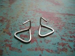
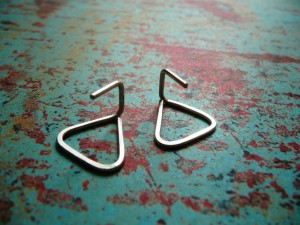
Begin your editing by doing any cropping that is necessary. Once you have cropped, resize the photos so that they are approximately 1000 pixels on a side. Then, edit the light levels. My best friend is the ‘Autocorrect’ in Microsoft Office Picture Manager. Just clicking that button turns this…

into this…

Can you see how much crisper it looks?
Otherwise, pay attention to the mid-tones, and the contrast. You want to bring out the best in your jewellery!
5. Choose a ‘look’ and stick to it
When I first opened my Etsy shop, I was taking photos on all sorts of different backgrounds. If you have a look at some of my older stock, you can se some of these photos. However, with some advice from fellow DUSTers (the Down Under Street Team on Etsy) I decided to unify the look of my shop by picking a small number of backgrounds and sticking to them. If you look at the sites of Etsy top sellers, you will see this is the same procedure they follow. It makes your shop look more professional and polished!
Don’ts
1. Have blurry photos
Would you buy a product online if the photo’s were blurry? Of course not. Now, there is a difference between plain bad blurry and ‘artistic’ blurry. For example, you may be photographing something quite large, and you just want to focus on a certain feature for one photo – this may mean the rest of the item is out of focus. This is okay, as long as the main focus of the photo is crisp and clear. If in doubt – throw it out and take another one! This is the beauty of digital photography.
2. Have a ‘busy’ background
Some jewellers like to photograph their jewellery with props. In some of my photos, like this one, I use a piece of driftwood to photography my jewellery on, mostly to prop it up and show it from another angle. Just be wary when you do this – don’t have a background that is too ‘busy’. You don’t want your surface or props to take away from your item.
3. Have photos that are too far away
Remember when you’re choosing your primary photo that most people will only ever see it as a thumbnail. Save your photo and look at it in a thumbnail size – can you tell what it is a photo of? Is it clear and inviting? If not, you may need to crop your photo. Don’t be afraid of cutting off part of your design in the main picture – it is designed to draw people in – you can use your other photos to show the whole product.
I hope you found this little do and don’t post useful! Do you have any other do’s and don’ts that you’d like to share with readers? If so, please leave a comment below!
For more information and advice, check out Artfire’s photography advice!
***
Want more Epheriell-y goodness? Subscribe to my blog updates! Or follow me on Twitter


Just Brilliant! Your photo’s are Amazing and they make your shop look fabulous!
thank you for sharing your photography tips 🙂
Thanks Jess, I need all the help I can get at the moment 🙂
Wonderful advice – I think I am going to be re-doing some of my pics!
Excellent post, your advice is just what I need.
Great post Jess – and I love the backgrounds you use for your photos!
Thanks for the positive feedback guys – glad I could help! 🙂
Great advice, and your photos are fab! That first photo looks really good – very sophisticated, with all the focus on the gorgeous jewellery. Thanks for sharing!
Great post!I do not do jewellery but photos are my black dot for my etsy shop!
Thanks
Thank you!
I really also try to improve Day by Day and I find it very difficult and this help`s.
Great post! Thank you so much for sharing.
Yes, indeed! Good looking photos!
Very nice tips you have given, specially your advice for filtered natural light is the thing that i like most. I am continuously applying these tips whenever i got to get a photograph.
Thanks!! Just lovely.
Thanks!
Helpful post Jess, Thanks!
I’ve been using a graduated grey background and am happy with it, for the most part… But for sometimes the plain grey just doesn’t represent the true feel of the jewelry. It can be a little sterile. I’ve been wondering about experimenting with some sort of prop. But, I’m worried about making things too busy and distracting to the eye. Maybe some modeled shots would do the trick? hmm…
Great tips!!! Nice photograph.. Must read article for all those who are in to this business. Thanks for the share..