I’ve been thinking a lot lately about my product photography.
I think it has improved over time – but I’m not yet satisfied that it is what it could be. I’ve seen a lot of comments around the ‘net, and also offline, to the effect that your photos are the key in online selling. And, of course, that makes perfect sense! Your customers can’t touch, move, or try on your product – so the photos are the only thing they have to go on. I’ve picked up some crucial tips over the last 6 months or so…
Â
Photography Tips
- Try to shoot in natural light. Next to a window with indirect light shining on your product is the best. Failing that, try using a lightbox.
- Use the Macro setting on your camera (the little flower!). This allows crisp, close-up photos.Â
- If you’re photographing clothes, use a model or a dummy – flat clothes just don’t look enticing!Â
- Use a simple, effective background. Too much going on can distract from your product. Some props can be useful, though, at times.
- Take photos from different angles. Your customers need to get a ‘feel’ for your product.
So, with all this in mind, I spent some time yesterday experimenting with my photography. I bought some scrapbooking paper at the Stitches & Craft Show, and I’ve been trying out different backgrounds for my jewellery.
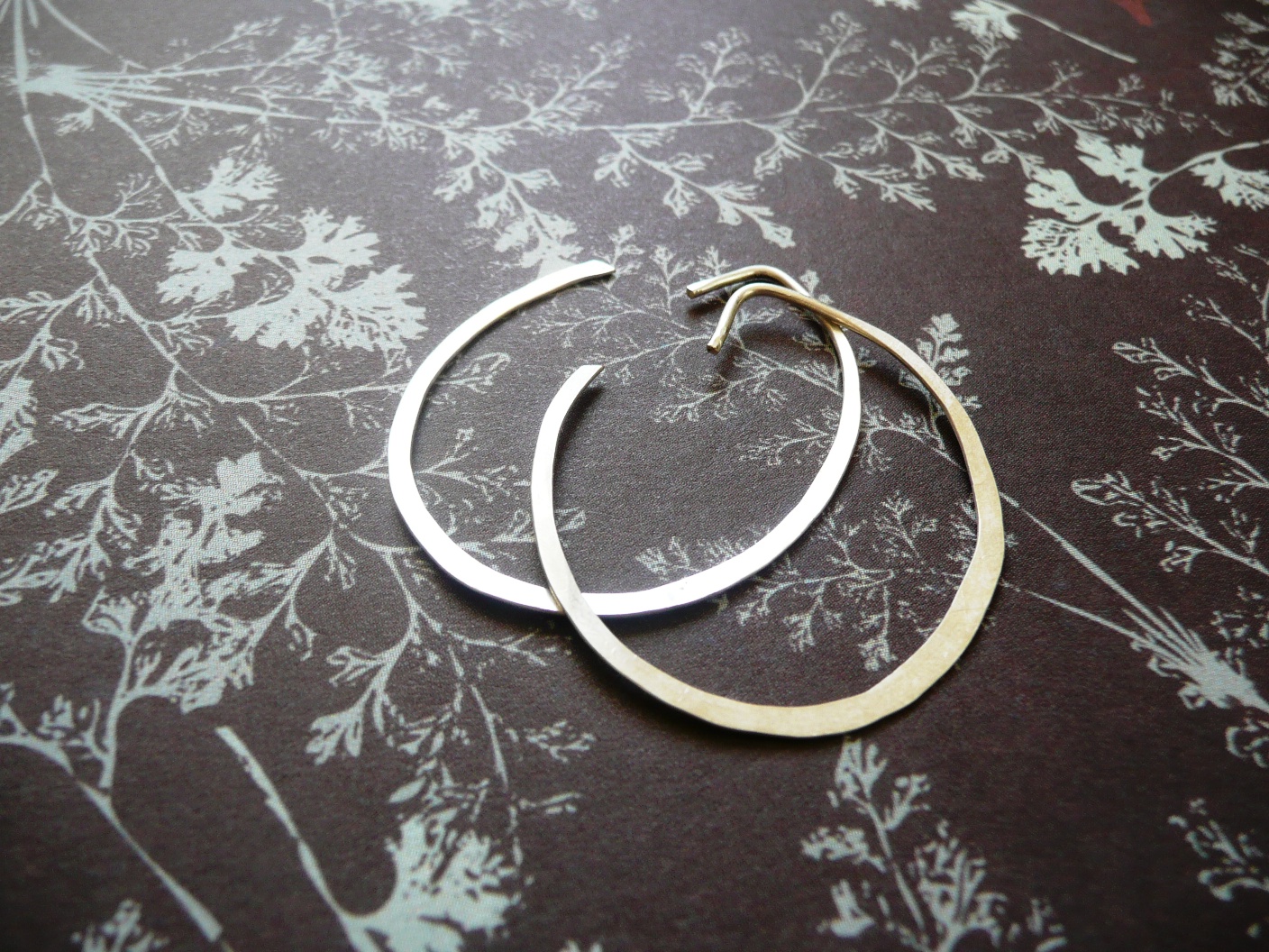
Here’s the same pair of earrings photographed in different ways with different backgrounds. Now, before you look, I’d like to ask a favour. If you were looking for earrings, which of the following photos would make you click? Which looks the most professional, the most enticing? Please leave me a comment with your answer – I’d really appreciate the feedback!Â
Now, on to the photos…
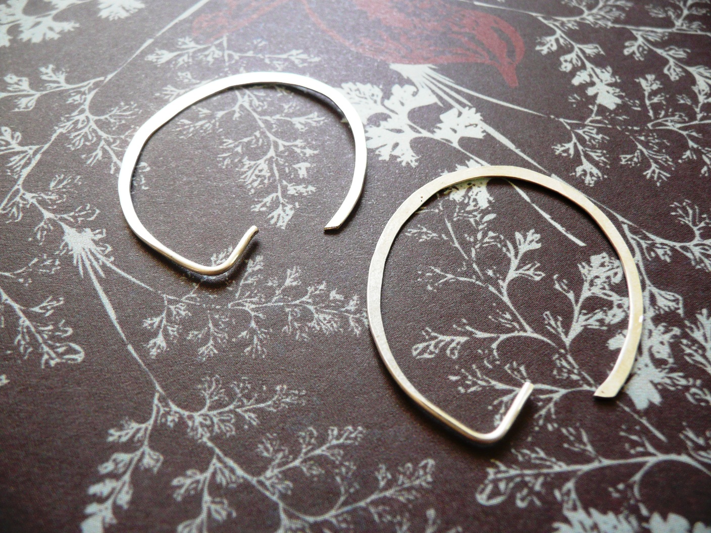
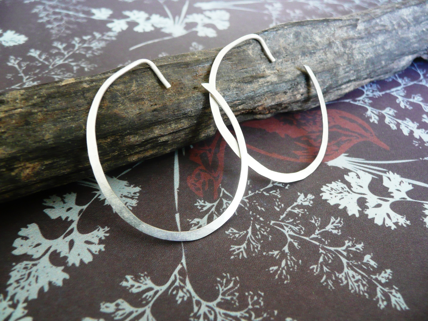
Â
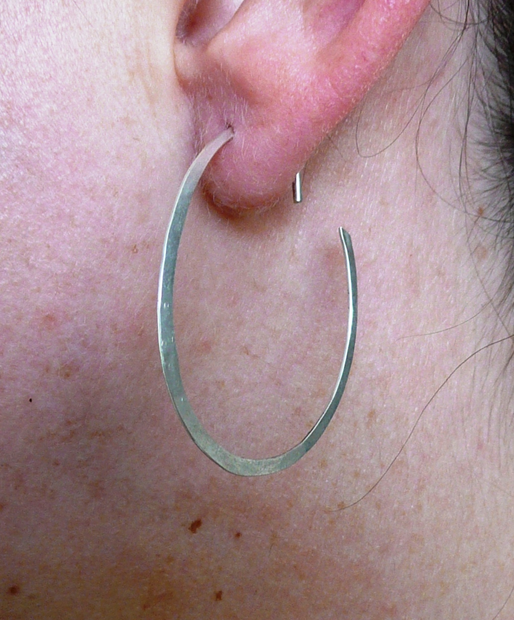

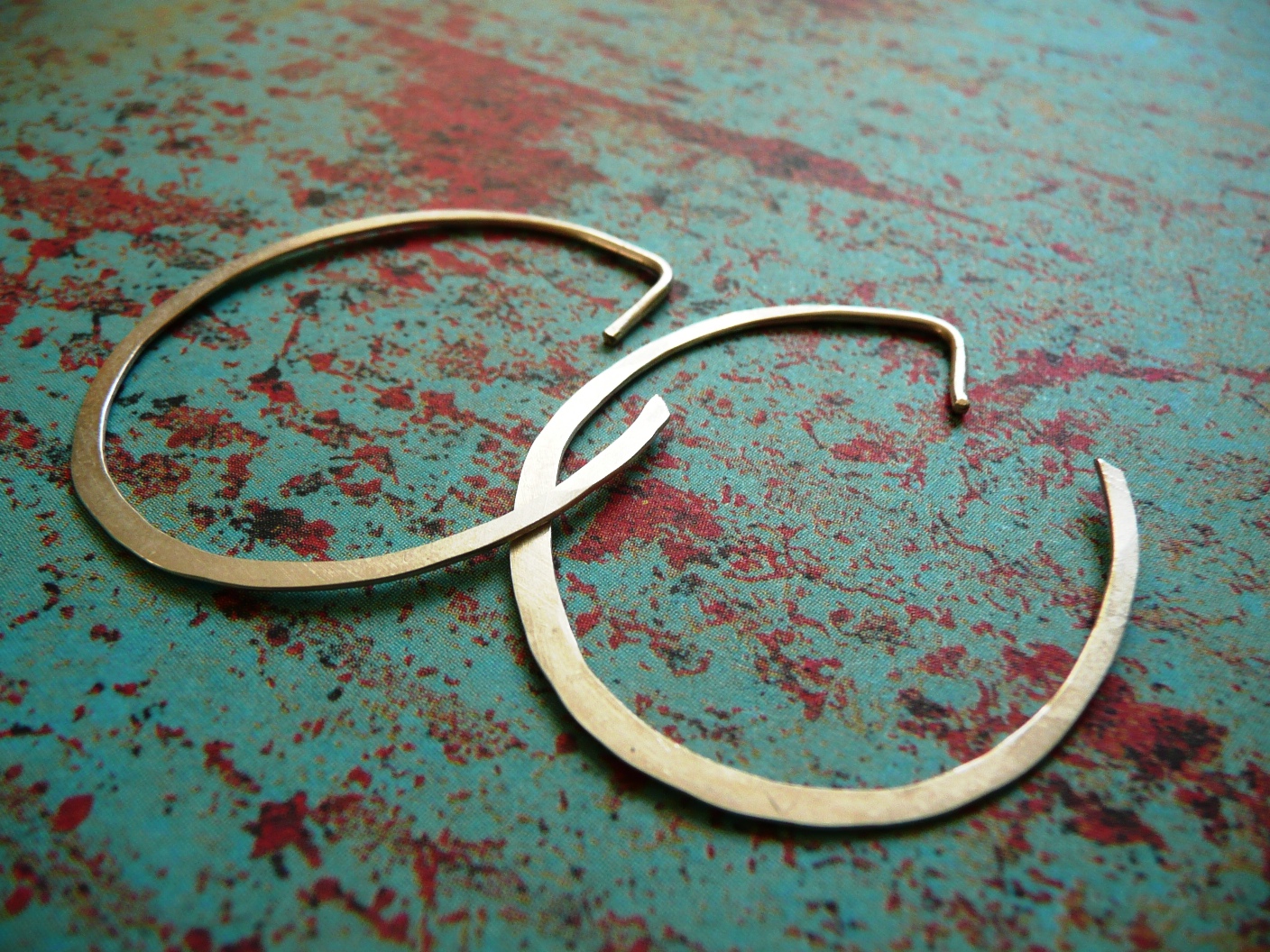

Â
These are some of my older photos, on the stone that I was using..
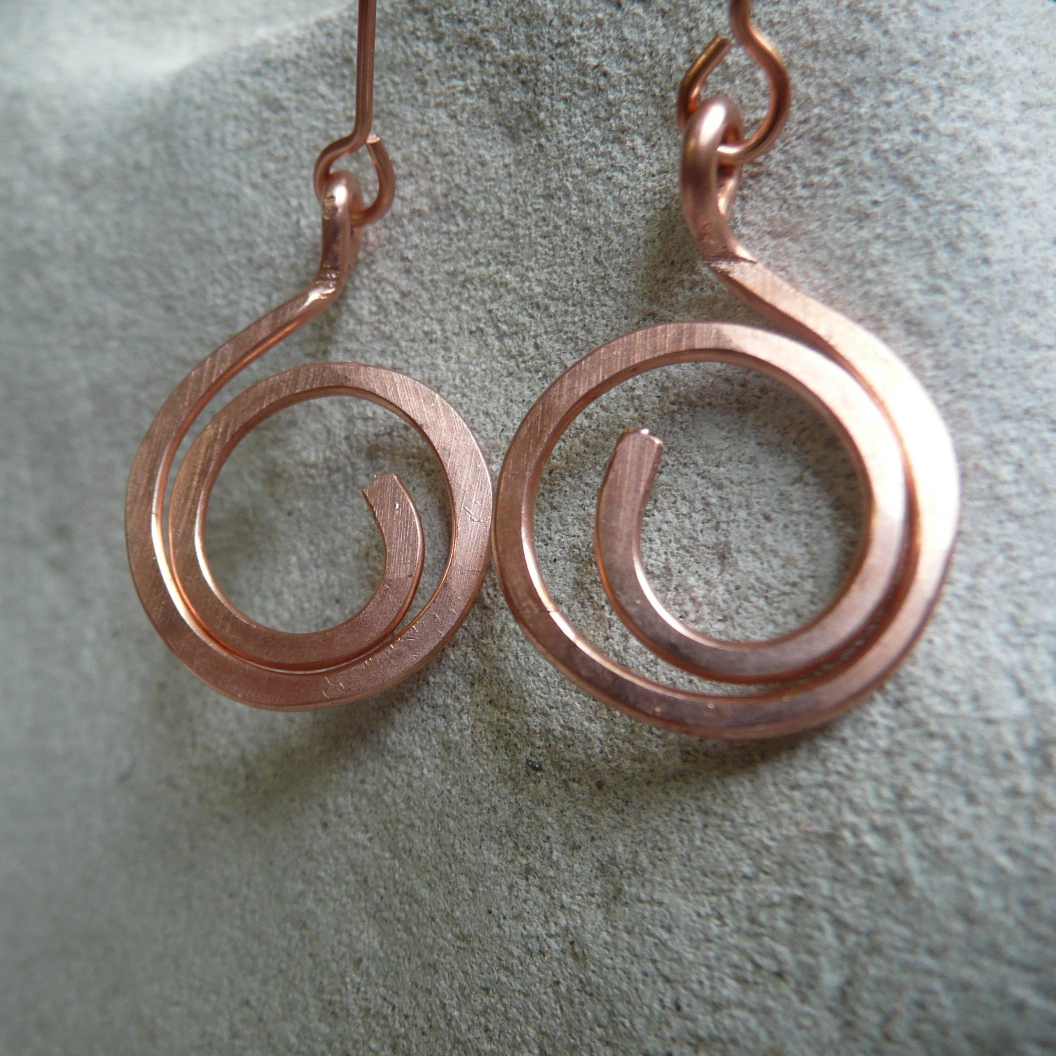
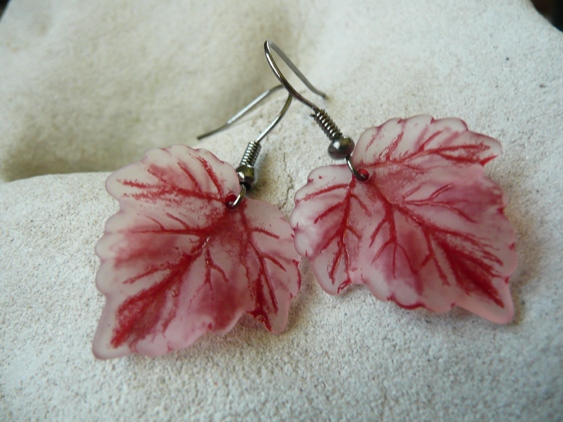
I quite liked these stone photos, as it gave a natural feel – but I don’t feel that my work ‘pops’ as much in them.
Which do you like the best?
Thanks for your input! Please leave me any tips you have from your experience, too 🙂 What have you learnt about product photography that you could share with other readers?
Â
Â

Well… I don’t like the ear pic. 🙂 And I don’t like the one with the stick. I do really like the one with the turquoise and red, and the last of the patterned papers – the grayish one. Actually I think all the paper ones look nice!
Interesting experiment!
They look great. No 2 sitting on the stick would make me click to have a better look. The one of them in your ears would make me click away-not that you haven’t got cute ears but I don’t like the thought that someone else has worn them 🙂
Megan, do you not like the ear because you think that’s the one you’ll be getting? I make all of these styles to order – so you get a new pair!
Jess love the scrapbooking paper – very nice! I think people are turned off by the ear, even if you make to order, people see the photo before they read the words and think it’s been worn.
Hmm, so better to just delete the in-ear photos? Or put text over it that says ‘made to order’?? I personally like seeing how it actually looks worn… great feedback, guys!
the red & blue, red & blue!
Lol – thanks Penny – I think that’s my fave too!
I like the 2nd one with the stick, i’d keep looking. the ear ones are a turn off as it makes you think they have been worn
I love the stick and the turquoise/red, and the use of the stone in the first pic. That could be more about the angle/close-up though…?
Great post 🙂
Thanks Nikki! I’ve changed the ear shots in my listings to be in black and white now… hope that makes a difference – let me know what you think!
Oh, I meant to add that the ear one kinda makes me feel squeamish. I wouldn’t click on that one! LOL
hi Jess – i think your photo’s are really really good, i love the scrapbook papers and use them too, my favourite photo is the hoops on turq&red i like that they are overlapped – my least fav is the hoops in your ears – i do find it a turn off! i’ve no idea why as i’m not a fussy hygene type! if they were dangly type earings it is good to see how they hang though?
best is of course red and blue but I still really like the stone ones as well, don`t really like the other papers with your work
quite like the one with the stick as well
xxx
Hi
What a good idea – to get everyone choosing their favourite. I go along with the majority that the red ang green works best. I think that’s because it’s a texture rather than a pattern and therefore doesn’t look too “busy” for the jewellery.
I love the 2nd pic and the last pic. I’m not fond of seeing earrings actually modeled.
I also like the red and turquoise background pic, but the hoops look gold instead of silver to me in that one.
Great job! I always think people who haven’t tried to photograph products wouldn’t have a clue how difficult it can be!
Love the red & blue – the positioning, camera angle & lighting have all come together really well. (Mendy made a good point about the gold/silver colour though. Colour balance could be photoshopped to help with this.)
I think I connect much more to the photos where the earrings are the “right way around” (as opposed to upside down, though I do love the blue & white paper).
I like the stick, but maybe it would be better placed on a earthy background?? The 2 contrasting background textures might be a little distracting…
I love the stone pics too – especially the last one. (Probably worth cropping/photoshopping the black corners out too.)
Must mention that I love the earrings too!
Oh goodness me you have some lovely stuff in your shop! I adore those little purple dangly earrings – they remind me of wisteria! I love the shell/resin pendants esp – I came so close to buying one as a bit of a….spell, I guess you could say. My partner is in the army and as much as we adore Darwin (I’ve lived her for 15 years after growing up in Tas), we are asking the universe to send us to Brisbane, but we really would like to live near the beach and he would commute to Enoggera…we have other family and friends there, and oh…the housing is MUCH more affordable than here.. Oops…life story! LOL
anyway, I came to say that the b/w ear shots are much better. All of your photos are so much nicer, too. Was obviously a worthwhile post to make 🙂
Thank you Nikki!! Perhaps I should make more of the shell/resin pendants!
Brisbane really is the most wonderful place 🙂 I’ve lived away – but always come back!
Hope you guys get the answer to your wishes!
I’m slowly hoping to re-shoot my photos over time… getting better, though!
I like the one on the turquoise paper the best. Second place goes to the one with the stick prop. GREAT photos!
Saw your blog bookmarked on Delicious. I love your site and marketing strategy.